IT & Corporate
Corporate office uniform design: Dressing every floor to one standard
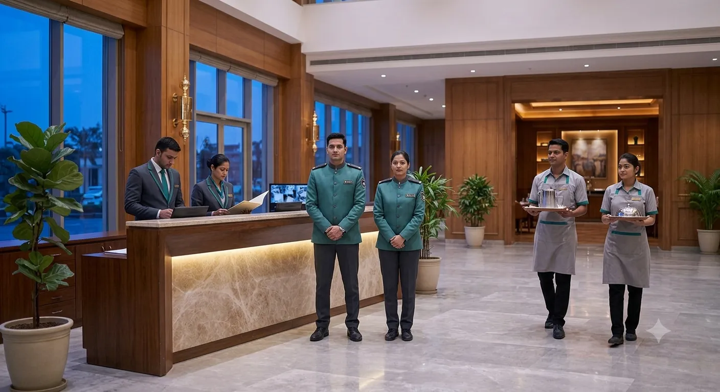
A corporate office is rarely one employer. The front desk is often one agency, security another, pantry and housekeeping a third. Each dresses its own people. The person who calls us is usually whoever owns the brand standard and has noticed that the lobby now contains three different shades of the same corporate blue.
That is the real problem in this category. It is not design. It is that four roles are being dressed by four vendors interpreting a brand guideline.
The four roles, and how much they should differ
They should look like one programme and still be distinguishable, because a visitor needs to know who to ask.
Front desk. The most visible role in the building and the one a visitor reads first. Formal shirt with a waistcoat or a blazer, in the brand colour or in a neutral that sits with the lobby.
Security. Must read as security, not as reception. A distinct colour, and visible rank if there is a supervisor on the floor. Resist merging this into the front desk look; the whole point of a guard’s turnout is that it is recognisable.
Pantry and F&B. Practical and washable. Shirt plus apron, with the apron carrying the accent colour so it can be replaced without re-issuing shirts.
Housekeeping. Deliberately different, in a colour that does not read as front-of-house. This is also the highest-churn role, so it needs the most forgiving sizing.
Design decisions worth making once
One colour reference, not one colour name. “Corporate blue” is not a specification and it is the single reason multi-agency lobbies drift. Approve a physical colour, have it recorded against your account, and make every agency order against that record.
Neutral base, brand accent. Put the neutral on the largest garment, the shirt or the trouser, and the brand colour on the smaller, cheaper, replaceable piece: apron, tie, scarf, waistcoat. A rebrand then costs accents rather than the whole issue.
Ladies’ and gents’ cuts, specified together. Not an afterthought. The same fabric, colour and branding, in cuts that actually fit, specified in the same document so both are produced from one approved reference.
One branding position. Left chest, or the collar, or the sleeve. Pick one and write it down with the size. Logo drift across a floor is more noticeable than colour drift.
What to specify
- Fabric and weight. Poly-cotton for daily wear; state the GSM. Under about 160 GSM a formal shirt stops holding its shape by mid-afternoon.
- Colour reference, held on file.
- Cut, ladies’ and gents’, both.
- Branding: position, size, method (embroidery holds up better than print on a garment washed twice a week).
- Quantity per person. Two sets, so one is always in the wash.
- Top-up terms. Corporate onboarding runs all year. Ask what ten sets cost in month seven and whether the rate is held for the contract year.
Making it survive a change of agency
Write the specification so it belongs to the building, not to the vendor. If the approved specification, the colour reference and the size file sit with a supplier who serves whichever agency currently holds the contract, then a change of contractor is a re-issue from a record, and the lobby does not visibly change colour halfway through the year.
That is the whole trick, and it is administrative rather than creative.